Recovery is gonna be slow. Doc said 6mo to a year for the scar tissue to settle down. I've always said 6 mo 'cause I want to be optimistic. We'll see. I can say that right now it's a wash... but that's a good thing. Only 2 and a half months in and it's up to as good as it was before. As they say... onward and upward.My tastes would tend to a more subtle script so my vote does not count. More important, however, is how are your feet doing?
-
Enjoy XS650.com? Consider making a donation to help support the site.
XS650.com receives a small share of sales from some links on this page, but direct donations have a much greater impact on keeping this site going.
You are using an out of date browser. It may not display this or other websites correctly.
You should upgrade or use an alternative browser.
You should upgrade or use an alternative browser.
Painting Tins. No really...
- Thread starter Jim
- Start date
Actually looks better when it's not full frame...

That is a poor rendition of "Candyapple Red"...
"Blue balls?"That is a poor rendition of "Candyapple Red"...

Actually thinking French Blue and Norton P11 pipes next project..."Blue balls?"
I dunno about the logo, but that color just pops!Been a day or two....
So, Madness' tins are done. Tank turned into quiet the ordeal... all of my own making I might add. All the way back in June... the day before my foot surgery iirc, I cleared the tank and vinyl... and got contamination. FUCK!!!
View attachment 249399
That was taken just after I shot... clear was still wet. 'Bout a week after surgery, I hobbled my ass down to the paint room to have a look. Shhh.... don't tell Sue. Anyway, fisheyes had settled down quiet a bit and I figured I could save it.... after I could actually walk again that is.
Fast forward to about a week ago and I started sanding the fish eyes out of it. There was a few on the vinyl, and after reading Gary's comment above about gas getting under the edge of some stickers on one of his tanks, decided to go back over the decals with about 3 more coats of clear. Buffed all that out and here we are.
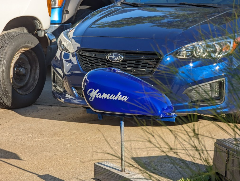
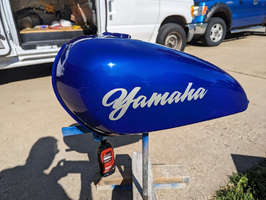
View attachment 249400
View attachment 249401
And of course, we can't forget the B-2 challenge coin shot...
View attachment 249402
So... here's the dilemma. Gary was worried the YAMAHA would be too big. I sorta shared that concern and when I initially cleared it, was pretty certain it was too big. After a week (off and on) of working on it, it's kinda grown on me. Now I think it looks good. I think Gary's still in the too big camp, but I'll let him speak for himself.
Time for the Borg Collective to shout out. What sayeth the hive, to big, too small or just right???
Actually thinking French Blue and Norton P11 pipes next project...
hovel
ol' stupid
What comes to mind is that there are a lot of younger folks out there who, beyond brand recognition, cannot read cursive.
Right now as a stand-alone the graphics really pop against that color. Mounted on a bike with all the other shiny goodies it probably will be a little more subtle.
Agreed.
Tank looks good.
I like that large graphic.
If it was smaller, it would need something else going on.
That Norton tank looks good with smaller script, but it also appears to have knee wells and a tank strap down the center.
I like that large graphic.
If it was smaller, it would need something else going on.
That Norton tank looks good with smaller script, but it also appears to have knee wells and a tank strap down the center.
From this angle the graphic looks like the perfect size honestly.
Well, we are talking Gary on Madness. The rear view is all you're really gonna see anyway.From this angle the graphic looks like the perfect size honestly.

This Norton has one of the best looking set of wheels n brakes I`ve ever seen.
 The whole bike is Killer detailed. Best contrast between frame and tins too.
Now where have I heard that before? Hmm...Best contrast between frame and tins too.

That tank looks luvverly. Certainly passes the good taste test for me - the large logo works because there's nothing else going on with the tank.
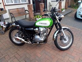
Bit of a different approach but here's a W800 scrambler with a large logo:

That Commando is beautiful but if I was being ornery I think it smells of too much money invested to get it there.
Bit of a different approach but here's a W800 scrambler with a large logo:

That Commando is beautiful but if I was being ornery I think it smells of too much money invested to get it there.
Last edited:
Similar threads
- Replies
- 214
- Views
- 26K


