Oh my little lunchpail? Amazon. 30.00.I like it! I like it a lot. I ordered me a headlight visor like yours to match my blue dot tail light!Gimmi some info on the front bag. Does it come in black? It's spiffy!
https://smile.amazon.com/Milwaukee-Motorcycle-Distressed-Luggage-PlainTwo/dp/B074VB1M7B
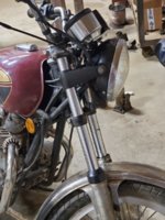
I would say it’s well worth it for the price point. I don’t think this one is a available in black, but there are a lot to choose from on amazon, probably more in black. The buckles are for show; the straps close with plastic pinch clips like on old backpacks. I don’t know how durable it will be but I needed someplace to carry around some tools and offs and ends I was always stuffing in my pockets. I chose this one because of the shade of brown and actually because it WASNT leather. Real leather wouldn't match the color or texture of my vinyl seat. I’m a stickler for consistency and not mixing too many types of materials or colors. I’ve always been pretty artistic and had a keen eye for aesthetics.
Here’s some food for thought- There’s a general rule in decor called the 60-30-10 rule. The basic concept is that 60 % of your room is one color, including large furniture, 30% a complementary color, and then you use a third color in little accent bits throughout the room. I actually discovered that I had followed this rule by instinct when putting together my studio, BEFORE I actually read an article about it.
green obviously is the main color, brown the second, and gold is the 10. You might not be able to tell, but the grill cloth on my old amp is gold, and my red guitar has gold hardware on it. The handles on my console victrola are gold and the frames of those little accent pictures above the windows are gold. There’s just enough throughout the room to be consistent. I have added a few gold lamps since taking those pics, but you get the idea.
I think my sense of keeping with this ideal is actually part of how my bike ended up with the look it has; all the “soft” components are brown, What metal can be shiny is shiny and not dull or machined, and the accent bits are gold. The frame is black and the tins blue, but the gold on the tins contrasts with the gold accents. When I put the buckhorns on I think I still had my old chrome shocks, so the only black thing was the frame. When I went to the black/gold shocks, the shocks “became part of the frame”, and black became more of a main color, and chrome more of an accent. If you go back and look at the pics of my bike, you’ll see it inly has 5 colors total; black, blue, gold, brown, and chrome/shiny metal. If you look at the blue/black painted surface of the bike as one color, that becomes about 30% of the bike. Chrome/shiny metal is another 30%, and then brown and gold each become little accent colors. The key is even distribution, not too many colors on your palette, and don’t over do your accent color.
Last edited:


")